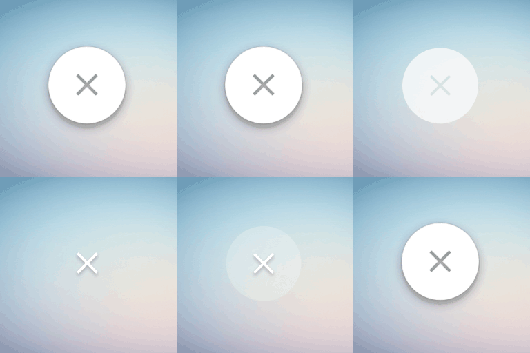
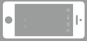
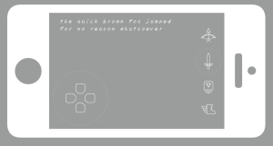
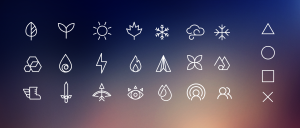
For the last project my constrain was to redesign touch screen buttons, without replacing their functionality with gestures. That basically means, that I just wanted to make a uniform visual scheme for using buttons in mobile apps. The reason I picked this was because I was thinking about how most mobile designers are trying to move as far away from the aesthetic of the touch button (the app Clear would be a good example). However, I wanted to play devil’s advocate, and thus viewed this direction as running away from the problem of mobile designers not being able to settle on one visual style. So I tried to make a flat style button that still felt like a button. I added dimension to the down state of the button and designed a variety of different icons that could be used in a game
Sep 11
7 of 7in7
Leave a Reply
You must be logged in to post a comment.


1 comments
Wow!! These icons are beautiful, this is the very icon which I was always looking for :D.