
I want to talk about flat design when we talk about a word such as ‘ Flatland” and “information representation”, the same as the passage” Escaping Flatland”said, we display information in a two-dimension world. The whole passage is talking about flatland as a way of information displaying.
And in the field of design , recently we have a contradiction about difference between skeumorphism and flat design, especially after Apple released their new iOS7 icon design. In my prospective, I’d like to regard the interface design of iOS7 as a improvement based on two reason: one is the skeuomorphic UIs for apple products in the past are commonly mistaken for “realist”. Secondly, flat design for new version of the UIs is an efficient information representation.
At the beginning, let’s look at the the calendar in apple’s product design, I don’t think it was a good design not because it is skeumorphism, but because it is overly designed. If we choose 2 of Dieter Rams’ “ten principles for good design” we get:
1. Good design is unobtrusive
2. Good design is as little design as possible
And we can see that icon design before ios7 the each detail representation of texture, shading is witha care and precise of designed. Apple has done a great skeumorphism in icon design since they start to using the users graphic interface first, all of those iphoto , trash bin icon design are perfectly good example of real life elements making a difference.
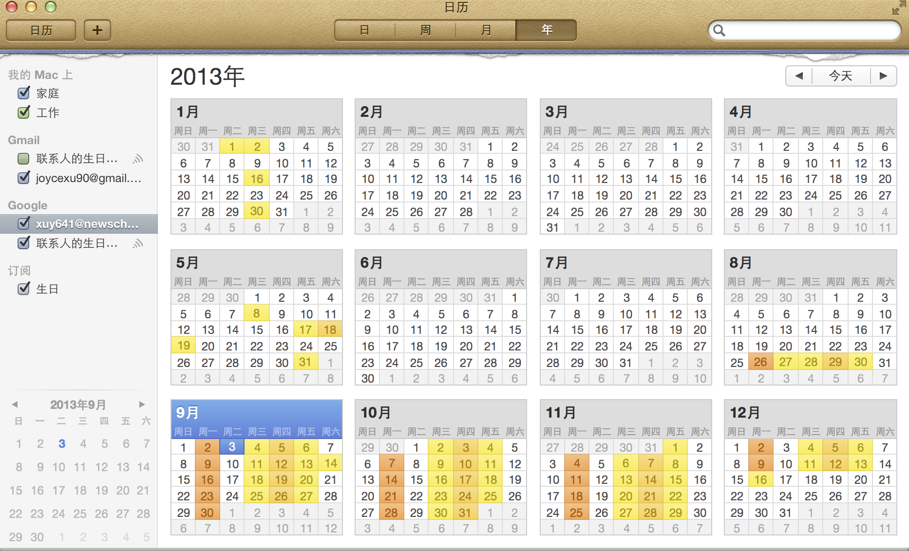

However , there are some bad example like apps of iCalendar on Mac and Find Friends application on iphone , they are overly design example for the sake of skeumorphorsm. the whole interface design just try to remind us of the real world and provided tons of useless visionary information like those calendar grid,and those fake leather stitching. I agree to the opinion as same as the author said in <<Escaping Flatland >>:’ It is all right to decorate construction but never construct decoration.’
Additionally, I think flat design is a good way of information representation. Flat design is an more abstract way of information representation . Flat design does not change skeumorphism or on the side against the skeumorphism. it merely reduces the textures used to their bare essence. It’s a new philosophy of simplicity , clarity and honest of material in users interface.
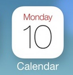
In the new icon design in Calendar icon in IOS7, we won’t see single element we familiar with or see anything remind us of a real calendar or texture in real world. It isn’t that concrete anymore. However when we see the number and date, we can understand it easily that is a icon for calendar. Let’s return to those fascinating idea what the author proposed in the passage of <<The Power of The Representation>>: ” A good representation captures the essential elements of the event, deliberately leaving out the rest.” What’s more, look back at the story the author demonstrate in the passage: People may use a pencil to represent a car , but it does not have the correct size or mass. It couldn’t show how fast a car can run, but it adds dramatically to the person’s power to describe the event. It enable people to people understand a event they’ve never seen in a good way. So I think this is a same powerful way of information representation as flat design does. Though flat design is more abstract information represent way than skeumorphism, but it brings no burden of information surplus. And yes, the critical trick to get the abstraction right, is to represent the important aspects and not the unimportant.
Comments