Week 2- Representations

Escaping Flatland/Things That Make Us Smart

The need for data visualization has existed long before any concept of a graphical user interface and it is now more important than ever to be able to master the skill of conveying information in its most clear and useful form.  In my past experience in research biology, figures are the key component of presenting your work.  This includes not only meaningful representation of raw data, but also the accompanying labeling texts.  Because direct interpretation is saved for within the body of the manuscript, the visual information must be presented in a way to guide the reader to the intended inferences, while maintaining scientific integrity.  Peer reviewers scrutinize figures heavily for clarity and honesty.

Socrates did not believe reading could provide reflective thought, though I think the frequent use of image represented information now would convince him otherwise.  Creating visuals that are meant to convey the outcome of a task, whether it be an instruction or data from an experiment, requires the author to capture some moment in time, and the reader to accurately perceive that moment again through mental reconstruction.  Obviously this becomes complex and dependent on the reader’s knowledge of the subject and the author’s ability to display the information, all requiring careful examination and reflection.

Reading Response: Week Two: 3-2 2-3

I’ve always been a Tufte fan, and what fascinates me the most about his work is his explanations and suggestions/revisions for theoretical apparatus (often classic) in an extremely practical way, and his examples of pictures and descriptions are always nested in each other perfectly, or as I call it: “purposefully visual”. Good visuals have a strong sense of structural hierarchy but still give the viewers some freedom to float around the layout.

I like to look at all types of information existing as have three dimensions, or as nature, thus all mediums of visualizing or reorganizing the information are modifications of possibilities of the three dimensions of the original. Once I have a relative base of the thing, I can tell what the modification does to the original version of the information.

There are fewer levels of ” being functional” than “being visually pleasant”, since the latter is more subjective, thus deciding whether one piece of visualized information is functional or not is much easier than describing how appealing it looks and what kind of emotional messages the designer is trying to convey along with the apparatus and the content.

In modern days, when visualizing data, or any other types of complex information structures in general, target audience is very often the FIRST thing we as designers are supposed to consider. Creative, new, or overly complex methods may not work well in a newspaper for general public. The process of making a visualization method be widely socially accepted takes a while if it is too outside the box or coming from nowhere, designs should be built based on certain types of roots, or as I call it: the moment when visual cliches may come in handy, as we have had plenty experiments regarding representation: composition, hierarchy, readability, and aesthetics .

Information Representation in User Interface #reading response 2#

I want to talk about flat design when we talk about a word such as ‘ Flatland” and “information representation”, the same as the passage” Escaping Flatland”said, we display information in a two-dimension world.  The whole passage is talking about flatland as a way of information displaying.

And in the field of design , recently we have a contradiction about difference between skeumorphism and flat design, especially after Apple released their new iOS7 icon design.  In my prospective, I’d like to regard the interface design of iOS7 as a improvement based on two reason:  one is the skeuomorphic UIs for apple products in the past are commonly mistaken for “realist”.  Secondly, flat design for new version of the UIs is an efficient information representation.


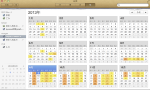
At the beginning, let’s look at the the calendar in apple’s product design, I don’t think it was a good design not because it is skeumorphism, but because it is overly designed. If we choose  2 of Dieter Rams’ “ten principles for good design” we get:

1. Good design is unobtrusive

2. Good design is as little design as possible


And we can see that  icon design before ios7  the each detail representation  of texture, shading is witha care and precise of designed. Apple has done a great skeumorphism in icon design since they start to using the users graphic interface first, all of those iphoto , trash bin icon design are perfectly good example of real life elements making a difference.

screen shot

2013-09-03 02.24.37

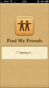
However , there are some bad example like apps of iCalendar  on Mac and Find Friends application on iphone ,  they are  overly design example  for the sake of skeumorphorsm. the whole interface design just try to remind us of the real world and provided tons of  useless visionary information like those calendar grid,and those fake leather stitching.  I agree to the  opinion as same as the author said in <<Escaping Flatland >>:’ It is all right to decorate construction but never construct decoration.’


Additionally, I think flat design is a good way of information representation. Flat design is an more abstract way of information representation . Flat design does not change skeumorphism or on the side against the skeumorphism.  it merely reduces the textures used to their bare essence. It’s a new philosophy of simplicity , clarity and honest of material in users interface.

屏幕快照 2013-09-03 上午3.10.51

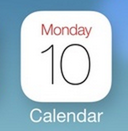
In the new icon design in Calendar icon in IOS7,  we won’t see single element we familiar with or see anything remind us of a real calendar or texture in real world. It isn’t that concrete anymore.  However when we see the number and date, we can understand it easily that is a icon for calendar.   Let’s  return to those fascinating idea what the author proposed in the passage of <<The Power of The Representation>>: ” A good representation captures the essential elements of the event, deliberately leaving out the rest.”     What’s more, look back at the story  the author demonstrate in the passage: People may use a pencil to represent a car , but it does not have the correct size or mass. It couldn’t show how fast a car can run, but it adds  dramatically to the person’s power to describe the event. It  enable people  to people understand a event they’ve never seen in a good way. So I think this is a same powerful way of information representation as flat design does.  Though flat design is more abstract information represent way than skeumorphism, but it brings no burden of information surplus.  And yes, the critical trick to get the abstraction right,  is to represent the important aspects and not the unimportant.


Information Representation

I did a freelance job once where the client gave me pretty much free reign. He told me to make an informational flyer for airport vendors and threw in some copy. I’m quite enthralled with the infographic trend so I designed this how-to sheet in the infographic style. I was pretty pleased with myself as I sent that pdf along with the cursory “If you have any changes, let me know.” Then I was pretty shocked when the client did in fact have some changes. He (obviously) thought it looked cool, but that it would be far too confusing for the target audience, who perhaps aren’t so up on design trends (and overall awesomeness). My elitism aside, I understood his point and redesigned the flyer in a simple, remedially easy way to understand.

When Donald Norman extensively explains how the Official Airlines Guide could be redesigned in umpteen ways, only to then conclude that for its purposes, it should remain just the way it is, it really resonated with me. I believe form follows function, but Norman made me think about how there are levels within function. When designing, I want to make things pretty automatically, but sometimes I have to pause before Illustrator’ing it up. The table works in the OAG because it communicates the most amount of information in the least amount of space, a criterion that was far more binding in the pre-internet era.

Both the target audience and the type of information need consideration, in order to properly design and represent information. That’s why the simple chart for when and how often prescriptions should be administered is brilliant in its simplicity and ease of use. The information is displayed experientially, rather than reflectively and as such, I’m confident in its ability to literally save lives.

The table concerning criminal activity of government informants in the Gotti case (in Escaping Flatland) uses a similar technique. The user has the same experience with the data in terms of search and computation. It lays out all the information in such an easy way that you determine patterns and understand the data in a much deeper and more fundamental way than as a narrative. There’s even an element of comic relief (at least for me) in recognizing exactly what Polisi is guilty of and the fact that “pistol whipping a priest” made it onto the chart, as if that is such normal behavior that we need to determine how many people have engaged in that activity.

As more and more information is readily available at our fingertips, it becomes even more imperative that that same information is organized and represented in a simple and function-driven manner. It is easy to get lost in the data if that data is not communicated properly.

Reading Response week 2-class 1

Escaping flatland


From this article, I learned that a good information design must have three elements: high quality maps which combine substance, statistics and design; diverse details which enable readers to understand the main idea in shortest time; several layers of close reading combined with an overview data from engineering surveys. Otherwise, the whole data display can turn into a chartjunk which is inaccurate, exaggerate and has little to do with the main content. I think this article is very useful especially in data visualization.

Power of representation


There is an old Chinese saying that “The palest ink is better than the best memory” which indicates how limited our memory is. By using some cognitive artifacts like experiential and reflective artifacts in representation, we can strengthen our mental power and be smarter. Experiential artifacts are easy for us to understand, however, reflective ones are not, because they require a lot of mental procedure. From this article, I learned that how powerful representation is, and what elements make a representation good. And I was totally agree with the sentence that “There is no single format can ever be correct for all purpose.” because in order to consider what type of representation we use, we need to think about the role of our readers, the purpose of our representation and the task to be performed. Also, I was very surprised when he said “numbers are really not natural, they are reflective tools, not experiential ones”, I mean, we see and deal with numbers everyday, I don’t think numbers are reflective. And then I realized I was wrong, as he said “it takes years of study in childhood to become proficient at arithmetic”. And maybe this is the reason why common sense and logic are often wrong.

Reading Response for 1st class

Facebook redesign

What are we talking about When we talk about facebook ? Or severely than all,social network.
The first things I am thinking about is information subscription, the whole information operating system.For example when I log in the facebook page, we actually have trapped in a information waterfall, The photos,status of our friend just swarm into our sight, and we just don’t know which part of the information is most valuable information to us.

If I could propose some idea for facebook redesign , it should be the information operating system. The users of facebook should have a larger privilage to classify their own personal information subscription. Firstly , we should classfied each type of the information in the news feed. For example if I want to see more news about design area , I can have a key to set up my subscription system, then the information filled in my screen will be mainly about design.

Another things I want to modified is privacy of the social network. Basically when we saw the photos or status of our friends we want to give feedback because human are naturally social animal.  And those conversation in the comment part are always based on a post by our friend. For example if my  family or closed friend  make comment on my below my post, and I don’t want other people see it , maybe I can edit the rights that who can see these comments, but not just hide the post from a certain scoial group.


Natural User Interfaces Are Not Natural

I  think this new passage is inspired me to think about what is most suitable way to interact with computer?  Today the touch screen had already replaced the physical buttons. I’m not sure the next generation knows anything about  what is the real “button”. What’s more , I think in the future , maybe we take a picture just by blink our eyes? And at that time may be there are more new problems and worries will appear, I don’t think there’s an end for new problems.

Therefore I don’t think we should worried too much about whether the natural users interface are indeed natural or not , but I think a good interaction behavior should involve in all six sense of our  human- being , maybe in the future we can interact by our eyes ears  mouth and some natural reaction which did by our body,  and yes may be there will be more problems appear. However, Let’s don’t worry about it, because design and technology is always about proposing questions , problem solving and not a final answer to everything.

Great Wall of Facebook: The Social Network’s Plan to Dominate the Internet — and Keep Google Out

All of us can’t deny that Facebook is fast growing company and story of the facebook can be found nowhere, All the classic old-media hats are being worn by everyone. The Facebook Effect can create a sudden convergence of interest among people in a news story, a song, or a YouTube video. One day recently I had been working on this book and hadn’t paid any attention to the news. I happened to see that a friend’s News Feed read “reduction in price for 3.5%.” I would in the past have received that information from Yahoo News, or from radio or television.  Facebook have changed the way people to acquire message. I agree to the statement made by the facebook veteran”Facebook is an advanced communications network enabling myriad communication forms”, and looking forward to see how will it looks like ,  A communications system that includes people of all countries, all races, all religions, could not be a bad thing, could it?

The Web Means the End of Forgetting


It is seems like we are exposing in front of everybody about our daily life since internet was invented, but I think we still have rights  to decide” tweet it or not”, I am still insisting my opinion is that keep relaxed and hesitate to think that if we should post it or not. In addition, I also think the posts made by ourselves on internet more or less is about reinventing ourselves and rebuild ideal  impression to other people. That’s a part of the attributes of the web. Thus, just regard the web platform as a big screen, think about what you want to exhibit about yourself in a big screen before we share information about ourselves to internet.  Though the things like Facebook and twitter told us you are the producer of the context. But don’t just do what web want us to do.

Why the future doesn’t need us

Computer is becoming more and more intelligent, and it is indeed , we are willing to see that computer are becoming a efficient helper of our life.  However I am not agree to author’s opinion based on two reason.

Firstly, the author is worried about the if we give a high permission privilage of decision making to computers,  the whole intelligence system will be too smart to controlled by human being. Secondly,  he thought that majority of the computer system will be controlled by minority of the elite, and a mass of people will become a superfluous workforces.  We are no longer being needed.

However I think that, firstly the whole complicated computer system is built by us. What we need to worried about is our own attitude, we should regard computer as a tool but not replacement of ourselves.  Additionally, I think human being owns two gift which one is intelligence and another is emotion. I don’t think a icy machine could replace  us so easy. Finally, I don’t  think  that elite will have greater control over the masses of computer. Almost everyone owns computer today, we could built our personal website if we want, we could create a technology project only if we want. Everybody owns a computer now. We need a progress democratization of technology. Everyone should learn some knowledge of programing and the basic theory of computer running in order to know more about computer.  I think the future with a more accessible technology need everyone of us but not  elite.


Week 2 Day 1 Reading Response

Escaping Flatland:

The idea that “every opportunity to spread through additional information over an already-available dimension must be cherished” resonated with me. The author stated this when discussing the train schedule mapping on pages 24-25. This reminds me of something I read in Donald Norman’s book, The Design of Everyday Things. Norman discusses the confusion that a panel of light switches can cause in a large space where there are many lights in all parts of the space that are operated by different switches. One solution to this was based on the idea that Tufte suggests: the designers utilized the already available dimensions and built a light switch panel that was an exact mapping of the layout of the light fixtures in the space. Instead of being mounted on the wall, they created a small platform almost parallel to the ceiling so that it was easier to understand which switch pertained to which fixture.

I really enjoyed this text and it gave me a different perspective on communicating through data. I loved the idea that “if the numbers are boring, then you’ve got the wrong numbers”, being that the depiction of data should relate directly to the data as opposed to making a purely visual non-representation of the data just for the sake of visual appeal.

Things That Make us Smart:

The biggest takeaway I have from this reading is that there is a huge importance in how information is organized and represented, which varies due to who the users are, what goals or tasks need to be accomplished with the information, and how the information is meant to be understood. When possible, the information should be easy to comprehend with little effort, but as noted in the flight departure and arrival example, ease of use cannot always take priority in the design.


Mind Over Mouse

Hey guys,


Thought I would share this article. It goes over what we talked a bit about in class regarding the use of thoughts to interact with technology. (This was in 2011!)


http://www.gizmag.com/thought-controlled-cursor/18353/

Facebook Redesign

My concept about the redesign is to make the home page looks more simplify, and let people feel more comfortable by using it. When I use the Facebook, I don’t really like the way they put our photos and status. The left and right side bars really occupy a lot of space, and this is the reason why the main content (place where we post our photos and status) looks so narrow. So what I’m going to do is to make these side bars “invisible”, they can only show up when your mouse reach the left or right edge of the page. I think this will make the page more “clean” and let people concentrate more on the content they saw on the screen.

Another problem I find is that when people post some really long images, and you want to leave a comment on them, you just can’t see the whole images,because the comment bar could block some part of the images. So I think, maybe this problem could be solved by moving the comment section to the right area of the photos. Also by doing this, people can leave a comment and looking at the photos at the same time.I remember once when I wrote a comment for a photo which my friends shared on the Facebook, I have to scroll up again and again to check if I wrote right about her photos.

I also want to do a little bit change about the chat bar, although it can be invisible when you close it, problem still comes when you chat with your friends. If you want to chat with a friend, you click the name shows on the chat bar, a dialog box will appears beside it. And if you want to chat with somebody else, another dialog box will appears too, eventually these dialog boxes are going to block the main content on the middle. I want to make the dialog box inside the chat bar, so you can chat with your friend and see the main content at the same time.

Facebook ReInvite: OpenDoor


OpenDoor

Idea: I got the idea from the dry erase doors set up in the new University center dorms.

OpenDoor or OD would be a blend between the socializing aspect of Facebook and the pseudo-world type realities of Second-Life and Home for PlayStation.

At the top level there would be a global view of earth in Wire outline of the sphere and continents. On the sphere, there would be a speck of light for each area that is connected with a brighter light for the amount of people in this connection (similar to the way we view artificial light (such as car lights, street lights, buildings and homes) from a satellite during nighttime.

As the user zoomed into an area he would see generic buildings in that area with doors lining each side as if a floating apartment hallway. These would be other users who you could enter their “room” if you were friends are leave public messages on their door or slide in private mail under the door.


The user could open his or her own room and choose any global position or even have a roaming door that followed the GPS position.

Inside the users room would be windows with user populated content such as pictures and videos, Private Mail Box, Public Door, and Walls.  Walls would be scrolling with friends Post that were open to anyone with visitor access to the room to see and news, events etc that the user wanted his friends to see.